Showing posts with label Layout. Show all posts

Sunday, 9 November 2014

Practice Makes Perfect: Calligraphy / Hand Lettering

Once again, it's been a little while since I've last updated my blog! Since beginning my job at a great little design company in Leicestershire, I have a whole new respect and understanding for all those 9 to 5 (or longer) workers out there! I feel your pain! I know your tiredness and it's taken me a little while to get into the swing of things.

In any case I'm not complaining - I realise how lucky I am for going straight into a job after finishing university and it's already provided me with so much more insight and knowledge in the world of graphic design.

In my spare time, I've taken to practicing my illustration skills in the form of typography and calligraphy! I even took a small morning course to get to grips with the correct way to write calligraphy this weekend, which was great fun! Now I've just got to stay in practice!

It shouldn't be hard - I absolutely LOVE it!


Wednesday, 18 December 2013

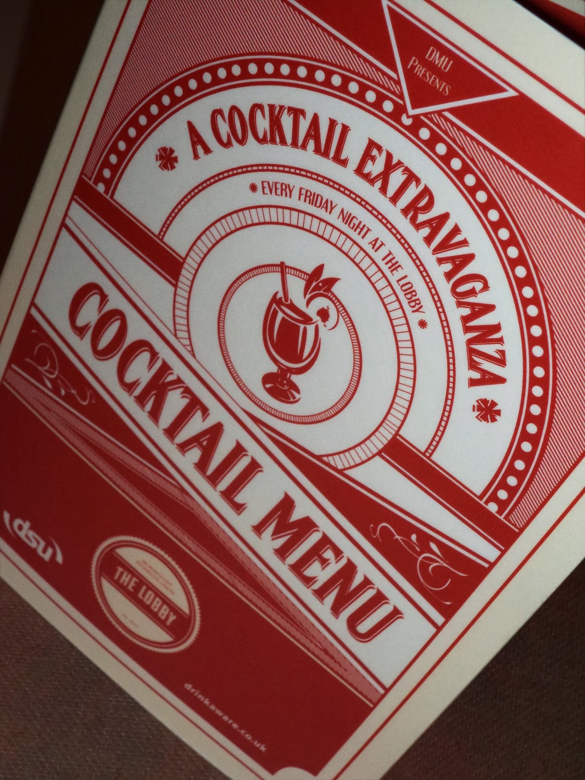
UPDATE: Great Gatsby Inspired Cocktail Menu!

Apologies for lack of updates, these past few weeks have been crazy!

Here's an update on the Great Gatsby style cocktail menu I was designing a few weeks back for my Students Union in Leicester! I'm really happy with how this turned out considering it was a piece that needed to be produced really quickly. As a result of this design I've also been asked to design some wedding invitations in a similar style so a job well done indeed it seems!

More updates to come soon! :)


Saturday, 4 May 2013

Finished Zine: View on Issuu

Finally finished my Zine and handed it in last Thursday, which was a big relief! 
I thought it'd be cool to share what I made on here!

My Zine is based on a typical lifestyle magazine, but for the dead housewife!
So a little bit of a twist on the norm.

Anyways.....


And let me know what you think! That'd be awesome! 

Friday, 19 April 2013

Zine Design: Finished Dead Housewife / Cover Girl

I started illustrating new components for a spread yesterday for my Dead Housewife based magazine and in the process of drawing this girl, realised that I could also use her as a cover girl for it. 

Here are a few screen prints of the different stages the design went through.
As you can see, half way through I decided to completely change the colour scheme and made everything she was wearing a shade of green.
I also really like the texture I've managed to get into her hair.


                 Snap shots of each step of the design and any changes that were made


Finished design with added textures

Thursday, 18 April 2013

Zine Design: Bulking Up The Content

Today I'm working on creating some more content for my Zine, based on a 'Good Housekeeping' magazine - but for the Undead. This particular image is for a page where new, hypothetical products are being reviewed in an 'Up and Coming' section and it is an advertisement for decorative Toe Tags.

I'm trying to keep the theme of the illustrations the same throughout the Zine so everything is being done witha graphics tablet in illustrator, before adding colour and texture in photoshop.
Below is a before and after of one section of this new spread. 


Line Work


Piece Almost ready for spread. 

Tuesday, 9 April 2013

Making Texture With Spray Paint

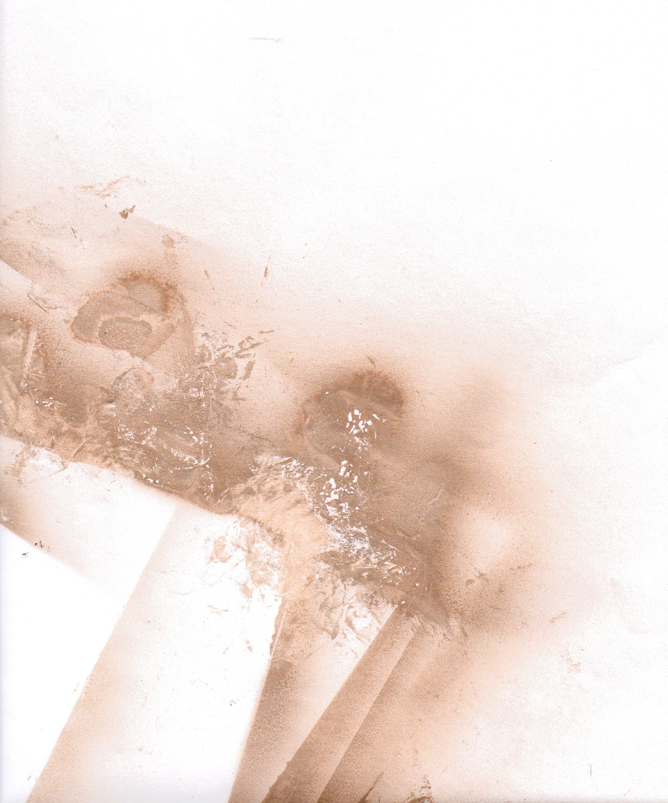
Today I've been trying to make a sort of abstract pattern using spray paint. The purpose for it is to act as a colour scheme / texture scheme for a project I am working on involving creating an identity.

I tried spraying onto paper and then taking some of the paint back off with crumpled up magazine pages, which worked fine but the best effect I was able to create was made by spraying onto acetate and then extracting. 


This first image is done using white paper, but the magazine paper I used to pick select bits off the page couldn't take as much of the paint off the page as I wanted it to, to reveal more white underneath. 


This second image is much more successful and was created using acetate. Because it is transparent, when I scanned it in - the gaps became even more white due to the light scanning it. Double win! 
This is the image I'll be using for my final colour/texture scheme in project.


These two final images are just the paper I used to cover my floor so I didn't get paint on the carpet! The different layers of paper and acetate that were laid on them made a pretty cool pattern though! 

Monday, 8 April 2013

Bookmaking: Another Finished Project


THANK F**K FOR THAT!
Another project I can cross off my To Do list! 

It's taken me a while but I've finally gotten there, and documented the whole process on video too!

For an idea that started out fairly un-refined and not really sure of where I was going with it,  I'm actually pretty damn happy with how it's turned out. Changing slightly from my original mock-up I think it's come out better at the other side. 


The books are completely different sizes and scales but you can see the initial ideas are the same, but the placement of the spinning wheel and the refinement of the layers have come a long way and a good job too. I think I'd be pretty unhappy if it still looked like that! However, no matter how much I slate the original design, without it I wouldn't have the final piece that I have today! So cheers to you shit mock-up.... You served me well!

I will also be uploading onto here a simple step-by-step video of the process which I recorded as something a bit different to hand in other than a sketch book for when assessment time comes. 


Wednesday, 3 April 2013

Zine Design: Making Changes / Updating Template

This morning I concentrated my time on bringing my Zine design up to date and making some changes that I though were necessary for my next assessment. The thing I was most concerned about was one of my comical 'style' pages that focusses on 'What apron is best for your body type' (Since my Zine is based on a Good Housekeeping-style magazine for the dead housewife)

The thing I didn't like about it was that I had originally hand drawn, and then scanned in my illustrations, which looked fine, but have ended up not looking like the rest of my illustrations in the Zine as I have done the rest of them digitally. 

Today was all about drawing in some new heads and adding them to the existing bodies. 
Below are the line drawings of the new heads, meaning to be a mix of all ages to fit the theme of the magazine - and then the final result of the page when imported into InDesign.


Tuesday, 26 March 2013

Print On Demand: Continued Development

I haven't posted anything in a while as I've taken a few days off due to it being Easter holidays and all. However in terms of work I'm just adding the finishing touches to my Print On Demand book for a bookmaking brief. I am slightly behind with this due to the time off I've taken but I'm hoping that by the end of the day it'll all be sorted and ready to be sent off to be printed! 

I think the hardest part is figuring out what kind of narrative/text I want to accompany the images.


Full spread preview


Close-up of selected pages (Unfinished)


Close-up of Line/Ribbon Detail

Sunday, 17 March 2013

Print On Design Book: In The Process

I haven't really done much work on my Bookmaking projects for a while and considering there is an informal assessment - but an assessment none the less is tomorrow I thought I best do something.

This is my plan (so far) for an abstracted Print On Demand book based around the theme of 'point' and displaying a days movements and encounters between different 'points'. 

There are still illustrations to be added, colour, page themes and and the ribbon needs to be finished with the correct colours and spacing, so there's still a lot to do. Liking the look of it so far though! 


Thursday, 7 March 2013

Re-Inventing A Book - Atlas Cutting

Today I began the long awaited task of recording the process of cutting up the atlas I bought for my bookmaking project, ready for the stencil layers (which I am still to cut) to go into. The stencil layers are going to display 5 different famous landmarks around the world and I thought that by cutting it from an atlas, it gives it a more meaningful state.

After I'd finished cutting the necessary layers out of the book, I noticed that some of the pages had been cropped into really interesting compositions - and these three are a few of my favourites! 

I plan on making a big montage of them in the near future, so keep your eyes peeled! The video of the whole process will also be released when it's been sped up so people don't have to sit through hours of footage before they get to see the final piece! :)

Wednesday, 6 March 2013

Hand Drawn Letterforms


Last year as part of my course we were given the brief of designing our own letterforms, based on anything we wanted. I designed mine around nature and trees/twigs without leaves in the Winter. 


Tuesday, 5 March 2013

Book Illustration: Abstract Portraits

For one piece of coursework in the first term we were given a brief to illustrate a book to help tell the story. The book was Brave New World by Aldous Huxley, which if you have read it will know is quite abstract and strange in its own right. With this in mind I wanted the images I made to reflect the story and tone of the book. These are not what I have used as my final pieces as I feel the intense colours were not a true representation of the darkness of the world in which the book is set, but are part of the process to getting there.


Saturday, 2 March 2013

Style Tests: Glass Frog

As part of my animation I've started experimenting with different styles in which to draw my Frog for the sequence. I found one geometric style by Matthew DiVito, which really caught my eye and made me want to try it for myself... So I did. 

As much as I love it though, I think I'd be making things more complicated than they need to be with this particular style. I do love it though. He looks like a piece of ceramic in the 4th image!


Wednesday, 27 February 2013

Valentines Day Vouchers

For Valentines day this year I wanted to do and give something a little different than your standard, shop bought Valentines card and so I decided that I'd make my own 'Valentines Vouchers'.

I decided to make them with the design in the style of an old fashioned ticket stub, with some more intricate detailing around the edges to make it more "Valentinesy". 
I made 7 vouchers in total. Each of these had a front and a back. The fronts all had the same cover design whilst the back of the vouchers all had something different to redeem on them, ranging from sweet things like 'Breakfast in Bed' to 'Wild Cards', which were redeemable for anything.

I think this is a much more personal and specialised gift and it gives you the freedom to have some fun with what the vouchers can be redeemable for! Happy Valentines ;)