Showing posts with label angles. Show all posts

Tuesday, 22 October 2013

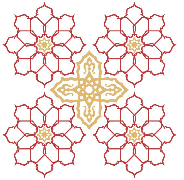
'MIRAGE' Textiles Pattern (2 part series) - NOW AVAILABLE!

Woo, I'm excited about this pattern!
Lovely, simple pattern to make and looks great!

I've named the pattern 'Mirage' and it's part of a 2 part series.
The other half, you can find on Society6 also!

To see the rest of the collection of this design, follow this link:
http://society6.com/Elmerchant/MIRAGE-02_Print?show=promoters#user_list

AND THERE'S FREE SHIPPING UNTIL SUNDAY!!!

Promote, and share with all your friends! :) 


Thursday, 11 July 2013

Moroccan Patterning: Repeat Pattern/Texture (Final Option)

The final option I created for the Moroccan food van I was asked to design for (at my internship) was a repeat pattern I made using a pattern I found and a texture that I created. This actually turned out to be my favourite result of them all, and annoyingly it only took me about 1 minute to create as I was messing around with some Photoshop effects for some ideas, and this happened! 

Yet again, it's another case of a happy accident when it comes to me creating patterns!

I kinda hope the client picks this pattern to cover his van!
It's definitely the best, in my opinion!


Wednesday, 10 July 2013

Moroccan Patterning: Continued

As a continuation of my post from yesterday, here are some examples of colour schemes I began playing around with after deciding on my pattern. Moroccan colours are generally quite earthy and golden, but their flag also has green in it. I tried to consider this when choosing my colours.


1. Red and Gold (simple but effective)


2. Green and Gold.
I developed the flowers a little further here by adding in some detail to their centres


3. Red, Green and Gold.
My favourite of the three. Bold, rich and lively.


I also played around with some other shapes and textures to try to create a mosaic/tiled effect.
Below is an example of what I mean.


I also tried creating a simple texture in Photoshop, which I'm aware the boss doesn't favour using (and which I'll post soon), but to be honest is my favourite design of them all... We'll soon see what the client thinks when he takes my mock-ups to him to view.

Saturday, 20 April 2013

Making Texture: Another Happy Accident

Yesterday I was attempting to make a textured background for one of my magazine pages using an image I found of a bit of rust. With some twisting and turning of the image I managed to create this FREAKIN' AWESOME pattern in the texture!

Sadly, it was too detailed to use as a background but it'd be perfect for using as a tiled image somewhere else! I like these happy accidents I have! :)


Sunday, 14 April 2013

Creating a brand identity: Poster Promotion

These three screen shots are the three final ideas I had for promotional posters for a graphics project. The whole logo and theme of the brand is based around the old, retro play buttons on cassettes and personal stereos - but with a modern twist. Logically, I called the range 'Play' and Goji is the brand that I am designing for. 

The posters are just an accompaniment to a pattern and a packaging based project, but I thought it'd be nice to try to tie in a poster with it for additional content.


This first one for me makes no sense to the actual theme of the range that I've already created, but it does look nice! 


This for me is one of my favourite designs but it also doesn't fit the existing theme of the range, as it's very minimal texture with lots of white space and is meant to resemble a spray paint type effect with the gold. This is just very decorative. 


This one however DOES fit the style I've been working with and I've also tried to make it look like a paint drip to tie in with the look of the pattern. This is the one I will be developing a little more to make my final poster. All it will need is some added information about the brand and it's good to go!

Wednesday, 10 April 2013

My "Happy Mistake"

Last night I was trying to make a metallic-looking texture to use as a colour scheme for one of my projects. I'd made some spray paint patterns with gold spray but when I'd scanned them in they lost their shine and their glittery appearance so I looked online for a simple metallic background that I could use alongside the sprayed patterns and combine them somehow to create more texture.

I started off with two separate images:


The first the metallic surface I'd found and the second the spray paint texture I made. I tweaked the levels and using the blending mode 'Divide' on Photoshop my main tile was made.


This was the end result of that process. 

As I was using this to cover an A4 sized pattern, or at least part of it, I copied the layer a few times and rotated it, flipped it etc. So that it all blended in nicely together and so that when overlaid onto my pattern, there wouldn't be any harsh lines showing where a few images had been used and stuck next to each other to cover the entire page.

What I didn't realise however until long after I'd finished, is that the pattern I eventually made by piecing a few of these images together was something even nicer than what I had intended! 


This final result reminds me of a kaleidoscope effect, or even some sort of jewellery like amber or rose gold. I guess sometimes the coolest things do happen when you don't intend for them to! Or as my teacher once called things like this... "Happy Mistakes". (But that sounds a bit dodgy to me)

Tuesday, 9 April 2013

Making Texture With Spray Paint

Today I've been trying to make a sort of abstract pattern using spray paint. The purpose for it is to act as a colour scheme / texture scheme for a project I am working on involving creating an identity.

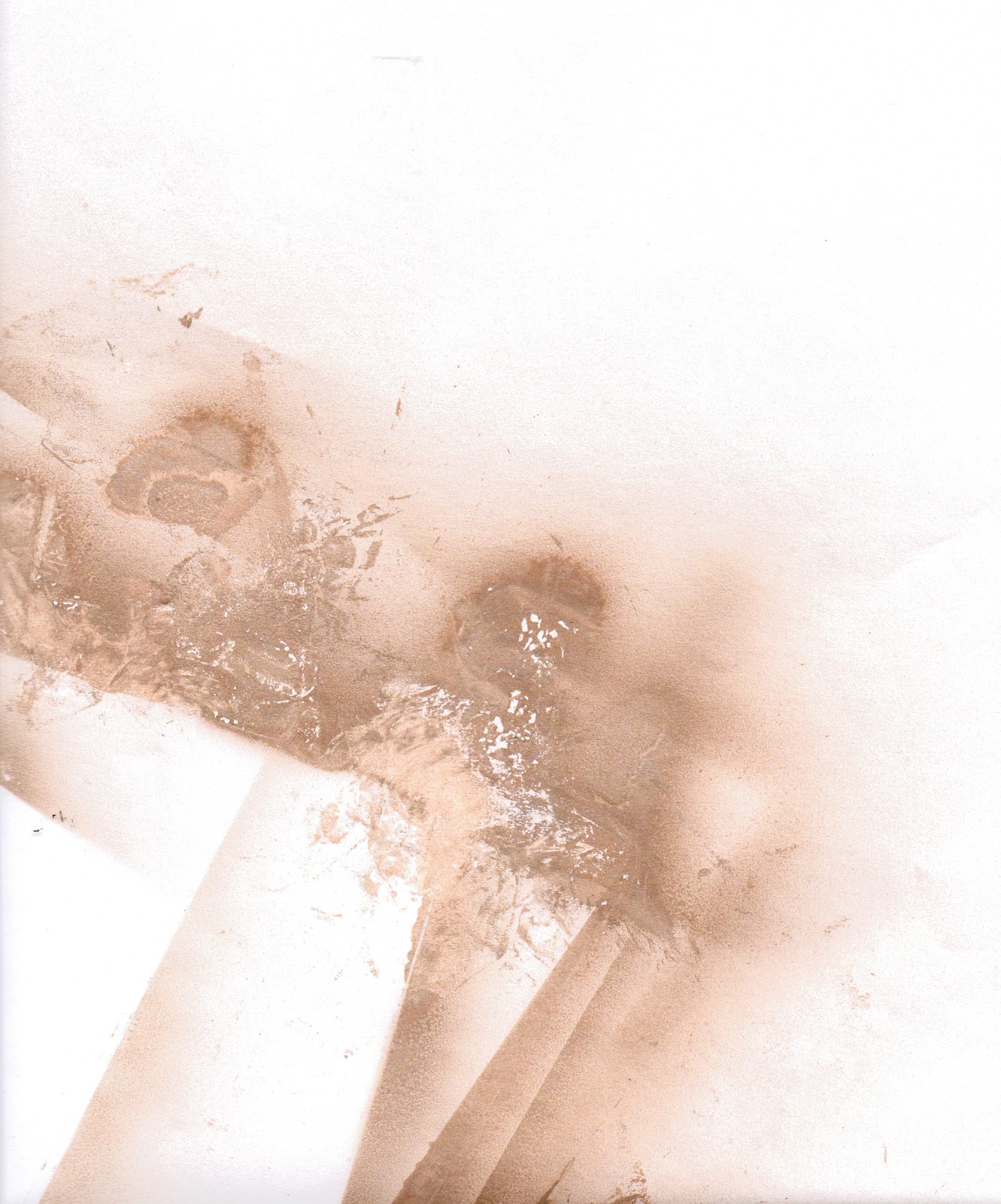
I tried spraying onto paper and then taking some of the paint back off with crumpled up magazine pages, which worked fine but the best effect I was able to create was made by spraying onto acetate and then extracting. 


This first image is done using white paper, but the magazine paper I used to pick select bits off the page couldn't take as much of the paint off the page as I wanted it to, to reveal more white underneath. 


This second image is much more successful and was created using acetate. Because it is transparent, when I scanned it in - the gaps became even more white due to the light scanning it. Double win! 
This is the image I'll be using for my final colour/texture scheme in project.


These two final images are just the paper I used to cover my floor so I didn't get paint on the carpet! The different layers of paper and acetate that were laid on them made a pretty cool pattern though! 

Friday, 8 March 2013

The Impossible Repeat Pattern

Designed for a brief and based around the Penrose Triangle (aka the impossible triangle) I made this repeat pattern, which was intended for a music accessories company to base a new range of products around. The idea for using a triangle came to me when I thought of the older, more nostalgic cassette players or boom boxes and their play, pause and stop buttons.

The triangle idea was further developed by me rationalising that if this pattern was intended for a range of music accessories, a key feature of this would be movement (both the musical side of it, and for the people that would be using it: people on the go). The Penrose triangle was thought of as it symbolises something that never stops and that is continuous and related well to music as that is also something that is constantly evolving and moving and changing direction.

I have made a small Ident (logo) to accompany this pattern, but both still need a colour scheme added to them. I'm quite looking forward to experimenting with this a bit further!