Sunday 31 March 2013

Animation Development: New Background Design

Today I've been continuing with some animation work and I've started making up the components of my next scenes background! I love adding texture to things like this, it gives it so much more character and life, and I even messed about with the blending options just for a bit of fun!


Original Image with black outline


Original Image, No outline


Altered Image - Looks tropical! 


Final Image - White Outline
This is what I'll be using in my animation for the background. 
It fits with the style I've created so far and looks pretty cool too! I'm happy.

Saturday 30 March 2013

Book Making Catch-Up: Stencilling work

I came home today from a week away from pretty much all of my work and as nice as it was, I knew how much I had to come back and finish. The first thing I picked up today though was my old Book making brief for our first assignment, which was to re-style a book in a sense based around the theme of 'Point'. Mine (which there will be a video for soon, to show the process) bases itself around Points around the world. 

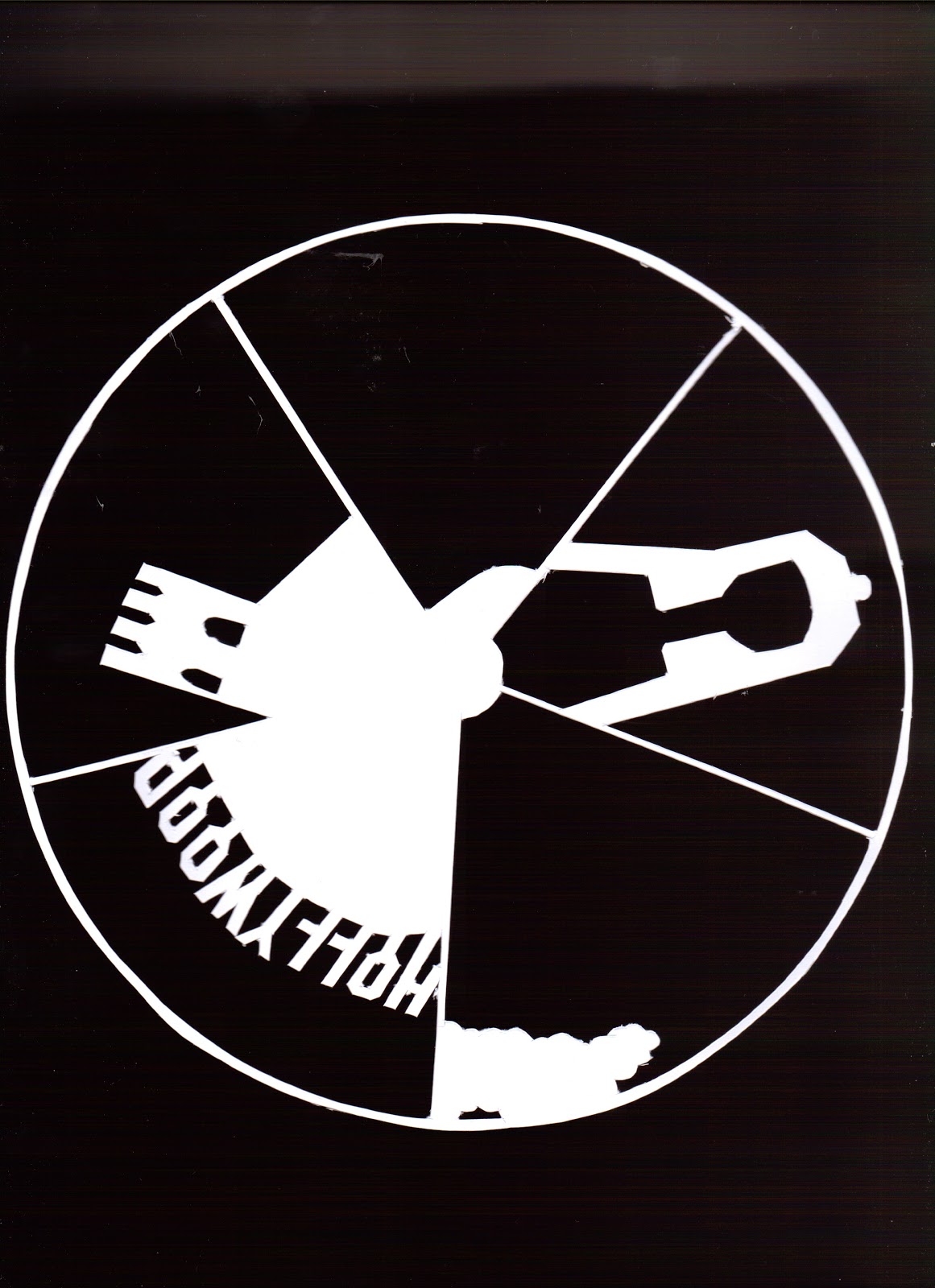
I've cut out the centre of an atlas and the stencils pictured below are going to be positioned correctly to make up their respective images within the hole. It'll then be put onto a wire and that will enable the stencil wheel to spin. 

ANYWAY!!! These are the stencils in their various layers and forms and then at the bottom I've layered them digitally (and adjusted the colours) for you to have some idea of what it's going to look like and what bits of each layer go where! I'm not sure if my final presentation will have anything other than white card though, I dont really like the colour. 


Final layered image makes up 5 famous landmarks:
- London Eye, England
- Sphynx, Egypt
- Eiffel Tower, Paris
- Hollywood Sign, Los Angeles
- Great Wall of China, China


Thursday 28 March 2013

Finished Book Design: Loco Motion

I have finally finished my Print on Demand book and I am very happy with it! I'm hoping the quality is as good on the printed version as the preview of it that I have of it online. It's taken such a long time to do and it's caused me a LOT of problems so I'm hoping it'll be worth it. 

You can actually preview my book by following the link here!


Here is the dust cover I have designed to wrap around my book. 

Tuesday 26 March 2013

Print On Demand: Continued Development

I haven't posted anything in a while as I've taken a few days off due to it being Easter holidays and all. However in terms of work I'm just adding the finishing touches to my Print On Demand book for a bookmaking brief. I am slightly behind with this due to the time off I've taken but I'm hoping that by the end of the day it'll all be sorted and ready to be sent off to be printed! 

I think the hardest part is figuring out what kind of narrative/text I want to accompany the images.


Full spread preview


Close-up of selected pages (Unfinished)


Close-up of Line/Ribbon Detail

Thursday 21 March 2013

Bookmaking: Page Layout Progress

So, I've pretty much finished making the continuous line that runs through my book look like a ribbon and I've started to add in some of the illustrations that are gonna make the line understandable. After all, it is a rough story, or visual diary even of my movements between different places during a single day.

Because the line is going to have a pattern overlaid on it I have tried to keep the illustrations simple and minimalistic to allow for the extra detail on the line and so it wont look too crowded in the end. Hopefully it's achievable! 


Tuesday 19 March 2013

Animation Sequence: Hot Air Balloons

This was something I made around the beginning of January after one of our first animation lessons. It was basically to learn how the tools worked for positioning, scale, opacities etc for the final project we're now working on. 


Sunday 17 March 2013

Print On Design Book: In The Process

I haven't really done much work on my Bookmaking projects for a while and considering there is an informal assessment - but an assessment none the less is tomorrow I thought I best do something.

This is my plan (so far) for an abstracted Print On Demand book based around the theme of 'point' and displaying a days movements and encounters between different 'points'. 

There are still illustrations to be added, colour, page themes and and the ribbon needs to be finished with the correct colours and spacing, so there's still a lot to do. Liking the look of it so far though! 


Saturday 16 March 2013

Animation: Sequence Sketches

Animation is currently taking up a lot of my time at the moment and no wonder when you have to draw every little movement in a different sketch! I'm trying to enjoy the process, and when I see the final sequence coming together the effort you've put in does make you feel good, it's just the hassle and stress whilst doing it that gets me down. Especially if you have to re-draw something that doesn't fit properly. Thankfully for these, tracing paper was a life saver and Im not that bothered that they change shape slightly. It'll make for an interesting transition I'm sure. 

These images are part of a sequence where my frog is looking up to catch a fly.

Friday 15 March 2013

Animation: Background Design

I keep forgetting how long making one part of an animation takes! As part of my second scene I've started to create these layers, which will form part of a forest-type background for me to animate over the top of. To fit my running theme / style of illustration I've given them a white outline with painterly textures overlaid within the leaves. Something tells me this is going to take a lot longer than I had planned to make everything this way though. 

Bring on the sleepless nights! 


Thursday 14 March 2013

Typography: Creating Letters In Smoke


This is another example of some older work I have done last term but its something I really enjoyed making even though it took me around 4 hours! This was a part of a project where I had to create my own Zine (small magazine), which could be based on anything I liked. My topic was a kind of "Good Housekeeping" guide for the dead housewife (so a twist on your standard preconception of this sort of magazine). 

This isn't the title of my magazine but the text created for an advert type page for a new perfume called 'Mascarilla', which I believe means 'Death Mask'. I added a Day of the Dead sugar skull into the foreground and made it look like it was spraying this text out of a trigger spray at the top of its head, so it was all very stylised and awesome (I think!) Lets hope the effort is worth the long term grade!


Saturday 9 March 2013

Before and After: Vectorising An Image

I'm still working on my Animation project, slowly but surely and yesterday completed the main image for the final scene of it. (Even though I've not made the middle of it yet, hah!) 
I thought it was an interesting before and after shot, and it was my first time of trying to make an image made completely of Vectors in Adobe Illustrator so I learnt a few different things from Googling my problems. I'm sure there's quicker ways to do what I did but considering it was my first attempt at a fully Vectorised image, without using Photoshop for the majority of the work I think I did pretty well. 

I'm not quite sure what name to give him though. Thoughts............?


Friday 8 March 2013

The Impossible Repeat Pattern

Designed for a brief and based around the Penrose Triangle (aka the impossible triangle) I made this repeat pattern, which was intended for a music accessories company to base a new range of products around. The idea for using a triangle came to me when I thought of the older, more nostalgic cassette players or boom boxes and their play, pause and stop buttons.

The triangle idea was further developed by me rationalising that if this pattern was intended for a range of music accessories, a key feature of this would be movement (both the musical side of it, and for the people that would be using it: people on the go). The Penrose triangle was thought of as it symbolises something that never stops and that is continuous and related well to music as that is also something that is constantly evolving and moving and changing direction.

I have made a small Ident (logo) to accompany this pattern, but both still need a colour scheme added to them. I'm quite looking forward to experimenting with this a bit further!  


Thursday 7 March 2013

Re-Inventing A Book - Atlas Cutting

Today I began the long awaited task of recording the process of cutting up the atlas I bought for my bookmaking project, ready for the stencil layers (which I am still to cut) to go into. The stencil layers are going to display 5 different famous landmarks around the world and I thought that by cutting it from an atlas, it gives it a more meaningful state.

After I'd finished cutting the necessary layers out of the book, I noticed that some of the pages had been cropped into really interesting compositions - and these three are a few of my favourites! 

I plan on making a big montage of them in the near future, so keep your eyes peeled! The video of the whole process will also be released when it's been sped up so people don't have to sit through hours of footage before they get to see the final piece! :)

Wednesday 6 March 2013

Hand Drawn Letterforms


Last year as part of my course we were given the brief of designing our own letterforms, based on anything we wanted. I designed mine around nature and trees/twigs without leaves in the Winter. 


Tuesday 5 March 2013

Book Illustration: Abstract Portraits

For one piece of coursework in the first term we were given a brief to illustrate a book to help tell the story. The book was Brave New World by Aldous Huxley, which if you have read it will know is quite abstract and strange in its own right. With this in mind I wanted the images I made to reflect the story and tone of the book. These are not what I have used as my final pieces as I feel the intense colours were not a true representation of the darkness of the world in which the book is set, but are part of the process to getting there.


Saturday 2 March 2013

Style Tests: Glass Frog

As part of my animation I've started experimenting with different styles in which to draw my Frog for the sequence. I found one geometric style by Matthew DiVito, which really caught my eye and made me want to try it for myself... So I did. 

As much as I love it though, I think I'd be making things more complicated than they need to be with this particular style. I do love it though. He looks like a piece of ceramic in the 4th image!


Friday 1 March 2013

Ant Animation Sequence

Today, our animation class was set the task of animating this small ant sequence in Adobe After Effects with some new features that we haven't used before. This is in preparation for our own animation that we'll be creating over the next few weeks. 

It was a lot easier to make than it seemed when our tutor was talking through it and I think the clip is pretty cute! I'm definitely looking forward to seeing what I can manage to create with my own now.