Wednesday 18 December 2013

UPDATE: Great Gatsby Inspired Cocktail Menu!

Apologies for lack of updates, these past few weeks have been crazy!

Here's an update on the Great Gatsby style cocktail menu I was designing a few weeks back for my Students Union in Leicester! I'm really happy with how this turned out considering it was a piece that needed to be produced really quickly. As a result of this design I've also been asked to design some wedding invitations in a similar style so a job well done indeed it seems!

More updates to come soon! :)


Tuesday 19 November 2013

BRAND NEW Canvas Prints!

Recently I was asked to print some of my work for a few customers, and it's the first time I've ever had work printed onto canvas! (By request). I have to say I really like the overall finish of them, but the pricing has little to be admired.

When I have the time I think I'll have to explore some more printing techniques and learn these things myself to cut down on costs! Fingers crossed the people will like them though! I do! 


Wednesday 13 November 2013

Creating A Cocktail Menu! (Gatsby Style)

Recently my boss asked me to create a cocktail menu for our Students Union new cocktail night. I've been given complete creative freedom with this, which is always a little more difficult than working to a brief, but tonight I've really taken off with the design!

I found a menu in a similar style and it made me think of The Great Gatsby and glamour and tried to capture this in the design. It's still unfinished, but tomorrow will be fine tuning everything and then getting it ready for print on Friday!

I was a little apprehensive about doing this but I'd be quite proud to tell people I've created this now after realising what I want to do with it! Keep an eye out for the finished product soon!


Sunday 10 November 2013

Twitter Poster: Another progress preview!

Just another little progress / preview picture of a bird characature of Milton Jones that I'm working on! :) All of the body and face is now done, just the feet to shade before I can begin adding in some simple highlights! 


Saturday 9 November 2013

SNEAK PREVIEW!!! Twitter Poster: Wing Shadow

So today I've been working on a project based around twitter and so in my design there of course is a bird! (Original I know!!!) But I thought I'd post some developments on it as they're happening.

If you've previously seen anything to do with a twitter project on this blog, please disregard it now! Concept has changed entirely as I'm sure you can see from the previous post! 

Below is a little preview of some of the shadowing I've started to add into one of the wings. And man it's taking a long time!!! Stay tuned for more updates!

Thursday 7 November 2013

Image Making Trial: Comedians Into Birds

For one of my projects based on funny tweets I've decided to try to make some famous comedians into the style of the twitter bird. My first attempt is at Roy Chubby Brown and just using simple line work and block colours I've coloured it in fine. All I'm wondering is how long colouring the rest of the birds is going to take... (Probably too long)... with how much time I have left and if it's really going to be worth it.... Hmm...


Another option I could pursue is perhaps just using tones as opposed to block colours. This way, shadow and highlight can be created easily and might look better overall....

I'm not sure... I hate choices. 

Monday 4 November 2013

Halloween Makeup 2013: Cracked Face

I ABSOLUTELY LOVE HALLOWEEN! :D

This year I wanted to do something a little different for halloween due to the fact that I was going to be dressing up more than once and wanted to save the real gore for the big party! (This one was just something I threw together quickly before I headed out to work!!!)

For my alternative to gore I decided to paint my face as if it had been cracked open / smashed. I found some reference pictures on the internet and set to work on this little beauty below, which only actually took me about 40 minutes to do. I was pretty unsure about it at first as the black lines on their own looked a bit crap, so I had to go in with some white highlights and some bronze eyeshadow for shading. In the end it turned out really well though, however it was sometimes often difficult for people to make out what the face paint was meant to be in person as the contours on your face (in person) make it a lot harder to decipher. When you're showing someone a picture, your skin looks flatter and you can see the illusion much, much easier!

I'm very happy with how this turned out though! Shame halloween can't be more than once a year! I love doing crazy make-up! 


Thursday 24 October 2013

Comedy Poster: Turning Famous Comedians Into Birds!

For one of our third year briefs, we have to design a poster for a comedy festival around the theme of twitter so I thought it would be pretty funny to try to turn some famous comedians from over the ages into birds! (Or just dress birds up in their attire)

I've tried to pick comedians with a distinct style so that it's easier to extract enough of their identity onto the blank birds. Below is a preview of some ideas I've come up with today! Bare in mind, these are preliminary sketches so the birds will end up looking much better by the end of the project!

See if you can guess who's who...


Tuesday 22 October 2013

'MIRAGE' Textiles Pattern (2 part series) - NOW AVAILABLE!

Woo, I'm excited about this pattern!
Lovely, simple pattern to make and looks great!

I've named the pattern 'Mirage' and it's part of a 2 part series.
The other half, you can find on Society6 also!

To see the rest of the collection of this design, follow this link:
http://society6.com/Elmerchant/MIRAGE-02_Print?show=promoters#user_list

AND THERE'S FREE SHIPPING UNTIL SUNDAY!!!

Promote, and share with all your friends! :) 


Friday 18 October 2013

New "Rust" Collection on Society6!

I'm really happy that I've recently discovered Society6! It gives me a chance to put my designs onto things I've wanted to for a long time, but have had no way of physically doing it. Although I'd prefer to be making everything myself, for the time being this is the best possible solution I can see! And it does have it's positives with people being able to promote and comment on your designs! 

So without further ado...


Available on all kinds of products! 
You can find the website here: http://society6.com/Elmerchant/Rust-aKd_Print

Wednesday 9 October 2013

SOCIETY 6 SIGN UP!

WOOHOO! I'm finally on Society6! 
Check out my designs on some awesome products!
You'll also get free shipping if you decide to buy when you follow the link!

http://society6.com/Elmerchant?promo=01ca38

If you're feeling kind, please share with your friends! <3

Wednesday 25 September 2013

FASHION FOR CANCER: Promotional Event Poster

In the past couple of weeks I have been trying to design a poster for a friend, who is putting on a fundraising event for 'Fashion Targets Breast Cancer' - a charity organisation doing some great work at the moment! I thought it'd be a great opportunity to help out in any way I could and was very happy to be asked to create the event poster!

The event will be held in DMU (De Montfort University) Student Union in Leicester on Sunday 3rd November, 2013 from 4pm onwards.  Everyone is welcome and there will be great things happening such as a catwalk showcasing DMU designers as well as outside companies! Plus there's going to be a guest performance from DMU's own cheerleading squad. 

You can find out more about the event and the charity by following the links below the poster! 


Facebook Event:
https://www.facebook.com/events/582038615187958/?ref_dashboard_filter=upcoming

DMU Event Twitter Account:
https://twitter.com/dmuvscancer

Fashion Targets Breast Cancer Twitter Account:
https://twitter.com/FashionTargets

Associated with DMU Square Mile

Friday 20 September 2013

Effect Test: Watercolour Painting In Illustrator

Continuing with some effects tests in Illustrator I wanted to do another watercolour image.
I used a random face off google for the black features, but then tried adding in tone and depth with different colours and shaped strokes with the built in brush tools.

This was inspired partly by one of my favourite artists, Marion Bolognesi, however I still have a way to go before I reach the standard of art that she produces!


Thursday 19 September 2013

Illustrator Brushes: Making A Watercolour Effect

Inspired by some fashion illustrations I saw,  I decided to try to make some images for a friends poster using the brushes on Adobe Illustrator. I wanted a watercolour effect and tried building up some subtle contour and shading using different brush styles and colours.

The only thing I found, which I didn't like was the fact that the colours weren't that vibrant when you used them with the 'watercolour' effect. Understandably, watercolour isn't meant to be eye-popping anyways but I think it could have enhanced it slightly.

I suppose I could always actually paint an image to get the desired effect, but that's going to be for another time...


Sunday 15 September 2013

Pattern Sneek Peek!

Inspired by some simplistic art work I found online, I've recently been creating a pattern for a competition. I don't want to give too much away as of yet though but here's a little preview of some colour options...


Saturday 14 September 2013

Vector Image Practice

Over the summer, whilst on my internship in a graphic design company it was suggested that I use illustrator as my go-to programme for creating things as everything is then vectorised and easily adjusted / resized etc. When I started, I only ever used illustrator for creating some outlines for sketches that I was planning on taking into photoshop so it was a little daunting for me!

Now, I cant say I've learnt heaps... But I have come to realise how cool illustrator can be and how useful it is! I've always wondered how people create vector images and I guess I'm beginning to finally understand how by exploring the tools the programme provides.

During the internship, all I really managed to create / assist with was some simple logo ideas and putting presentations together for clients. I didnt really get the chance to try making images as such. Since then, I've had a little practice and I decided to try creating a little fox! :)


I originally created him for a design I was working on for a competition but have since decided against using him. Still.. I'm quite happy with how he turned out considering it was my first attempt at vectorising anything properly! 

Onwards and upwards!


Tuesday 27 August 2013

Woop! I finally have a logo!

So I was just about to put a small presentation together for a project I've been working on and thought it'd actually be really cool if I could put my own 'stamp' on it sorta speak, so what better way than to make a simple logo for myself. 

I know a few of my friends have already made themselves a little something that they use, I just hadn't got around to making one myself nor have I really needed one in the past. 

Admittedly, the logo itself isn't much at all and it literally took me about 5 minutes to make, but I like it and it will do for now until I can come up with something better (or need something better even!)

The good thing about something this simple too is that you can jazz it up a bit with colour, as and when you need it! Anyways... without further ado... 

Voila!


Wednesday 14 August 2013

Procrastination: Zombie Maker

Yesterday I almost sat down to do some summer project research until I realised that I could have more fun by turning my friend Nik into a zombie. I'd done something similar for a Zine I created for coursework this year, which he really liked and so when he said this I set about turning him into one (but more gruesome and gory than I've done before)

It's sad to say that this is the first bit of art I've created this summer for fun, rather than for someone else. Suppose I had to start somewhere! 


- Original Photograph -


- Zombie Nik - 

Thursday 8 August 2013

Branding Project: More Logo Tests

Last week I continued working on the 'Coral' project with some different ideas. 

Considering the brand is meant to have lingerie and swimwear strands (under the name of 'House Of Coral') then I thought of using something lacy looking to encompass this. Something girly, flirty and fun.


My first idea was to use something that looked like the lace you find around the top of a pair of stockings and then fill the centre with a title. I quite like how this looks overall but I'm not sure how well it'd work as a logo on its own.


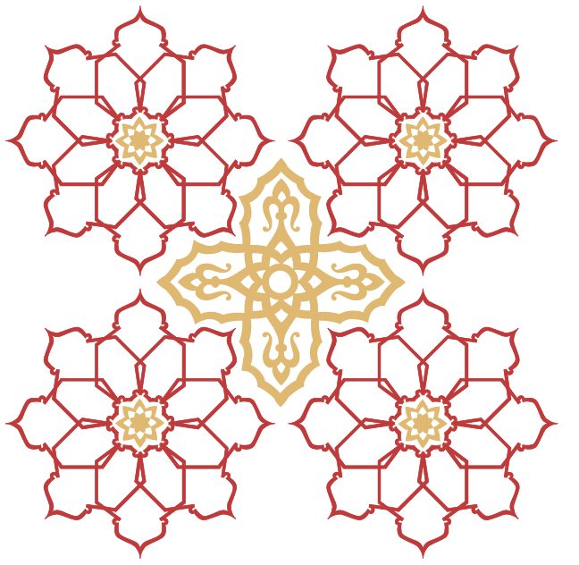
From there I wanted to try something that would look like a cut-out / stencilled look - and possibly something that could be laser cut to achieve this...

This is where my ideas led me... 


I thought that this kind of design would work well if it was used for a clothes tag or a price tag.
The side design could be cut out with a laser and it could be quite elegant looking. 


Similarly, I thought that something like this might look nice for a tag or logo or shop front design.
However, as nice as it might look I was concerned with the practicality of cutting something out this small... There's bound to be a better way or simpler way to do something elegant and fun...

Further designs to follow soon... :)


Thursday 1 August 2013

NEW PROJECT: Company Branding / Logo Design (Initial ideas)

FINALLY! I have a new project to work on at my internship and it's a branding one involving everything you can think of... logo, posters, website, shop graphics... the lot!

I've done all the preliminary research about industry competition and started putting a client presentation together so when the project is finished (I don't think i'll be here long enough to finish everything) - bits can be dropped in easily as there's already a template available. 

Today is the first day I've begun making some logos for the new company, who are calling themselves 'Coral'. I think the first obvious steps of designing the logo would be to do what I've done and go straight to working with coral shells and sea coral. 


With the first shell I think I am going to try to figure out a way to use this as a 'C' for the start of the company name 'Coral'.


-A Closeup of two of the shells-


-A closeup of two pieces of sea coral-


I have also tried to use a kind of hibiscus flower native to the company's startup country - Jamaica. I'm not too sure how I feel about these yet though...


- Close up of flower-


This is just the start. More to come soon...

Monday 22 July 2013

Internship Work: Pop-Art Inspired Logo Ideas

Currently, at my internship I've been working (and am just finishing off) some logo designs and a presentation to show a client who is looking to re-brand/re-design their cafe. The name we have been working with so far is 'Hot on Top', and based on some pop-arty styled things we've seen around areas of London like Shoreditch and Lambs Conduit I drew up some hand written logos.

I don't know what will be presented to the client yet, but I really like the hand written, script looking text I've made... When it comes to choosing a definite colour though, the decision is really difficult to pick a favourite! 


Below is another variation on the theme I drew into the computer with my graphics tablet. Whatever I decide to use, the choice won't be an easy one! 


Thursday 11 July 2013

Moroccan Patterning: Repeat Pattern/Texture (Final Option)

The final option I created for the Moroccan food van I was asked to design for (at my internship) was a repeat pattern I made using a pattern I found and a texture that I created. This actually turned out to be my favourite result of them all, and annoyingly it only took me about 1 minute to create as I was messing around with some Photoshop effects for some ideas, and this happened! 

Yet again, it's another case of a happy accident when it comes to me creating patterns!

I kinda hope the client picks this pattern to cover his van!
It's definitely the best, in my opinion!


Wednesday 10 July 2013

Moroccan Patterning: Continued

As a continuation of my post from yesterday, here are some examples of colour schemes I began playing around with after deciding on my pattern. Moroccan colours are generally quite earthy and golden, but their flag also has green in it. I tried to consider this when choosing my colours.


1. Red and Gold (simple but effective)


2. Green and Gold.
I developed the flowers a little further here by adding in some detail to their centres


3. Red, Green and Gold.
My favourite of the three. Bold, rich and lively.


I also played around with some other shapes and textures to try to create a mosaic/tiled effect.
Below is an example of what I mean.


I also tried creating a simple texture in Photoshop, which I'm aware the boss doesn't favour using (and which I'll post soon), but to be honest is my favourite design of them all... We'll soon see what the client thinks when he takes my mock-ups to him to view.

Tuesday 9 July 2013

Start Of The Summer Work: Moroccan Pattern Work

Yesterday, I began my first day at a graphic design company as an intern (and thankfully not the making cups of tea kind!) I've actually got some work to do! The office is fairly chilled out, with 3 of us as interns and a few 15 year olds on work experience running around and so far - so good. The only thing I'm not enjoying (and won't begin to) are the long days. 9am leave the house, 8pm arrive home :(

The first project I've been given however is a patterning project for a client starting up his own mobile Moroccan food van, so the aim was to create a pattern/design we could digitally print to cover it.

What's also challenging about working here is that the boss likes to do everything using Adobe Illustrator, which to me (at times) can seem like a nightmare! Anyways...


1. Outline created using the pen tool to mimic the shape of a Moroccan lamp

2. Filigree/Natural design found to fill in gaps and create a different look


3. Flower design created using multiple shapes (very messy)

3a. Cleaned up flower design with the star of Morocco in the centre


All of these small components had to be tested out in tiles / whatever design I thought would fit the van well and colour would be a key issue. Today I think I have finished my preliminary ideas. Tomorrow the big boss will hopefully tell me where to go from there on... 

More pictures to come...

Monday 17 June 2013

Competition Time!


To try to keep myself in practice/my hand in the door sort-of speak, I am going to be trying to enter some design competitions over the summer and I recently found a new website (http://www.creativeallies.com) where this was possible!

The piece above was something I created using a similar pattern that I have previously displayed on this blog (but altered slightly to fit the competitions brief) as it seemed to tick most of the boxes that it was asking for. It is a commemorative piece of art designed for the music artist Woodkid to celebrate the release of his debut album, The Golden Age! 

Soon, I think there will be a chance for people to vote for their favourite entries so I am excited to get the link posted out as soon as thats possible! Fingers crossed my design can gain some good numbers!

Sunday 2 June 2013

My Trip To Switzerland: Video Footage!

So my last post was about the awesome time I had in Switzerland over a weekend in early May... and this... well... I've finally finished putting together and editing the video footage that I captured into a pretty cool montage for your viewing pleasure! 

I hope you enjoy!


Tuesday 21 May 2013

My Weekend Trip To Switzerland

This weekend I traveled to Switzerland with my mum, aunt and aunts next door neighbour (lol) to visit my cousin who is currently working out there! As I have no work to post at the moment, I thought I would post some of the photos that have inspired me ready for my next art venture, which I am a little bit excited about to be honest! Here goes...


Day 1:

What an awesome way to start the first day in Switzerland! After leaving the airport we all walked around Lake Geneva, and I ended up spending most of my money on chocolates for people (although I'm not sure who yet, haha) and took some amazing photos! We then retreated back to my cousins house - fully equipped with a bomb shelter (?!) and got cosy for the night. Considering it wasn't a terribly busy day, the walking and the flight definitely tired me out! 


Day 2:

The second day absolutely ruined me after 4 hours of walking at different inclines around the open air Swiss museum! I Kinda forgot that 'walking around' in Switzerland generally doesn't include a level surface. It was a great day though and awesome to meet up with my friend, Joy Paton, outside of Leicester though. The views there, which included lush greenery and snow capped mountains, were absolutely incredible - as were the ones at the lakeside where we ate dinner. Absolutely mind blowing! That evening we spent watching the Eurovision song contest (more like forced to) and just chilling out. It was a well deserved rest!


Day 3:

This day was another brilliant day... possibly the best yet! We took an exciting tram and cable car ride to the top of a mountain, which slowly ascended into the snowy peaks where we ate dinner amongst the clouds and memories of the fun I had snowboarding came flooding back. It was incredible to go from standing on green pastures, to standing on snow within a matter of minutes! This was followed up by a visit to the ridiculously cute village of Gruyeres where after a challenging climb up the hill, we were greeted with cobbled roads, traditional Swiss horn players, a lovely castle and more incredible views! The castle gave me some awesome ideas for some art work, which I am eager to get on with as soon as I get back to my desk in Leicester! :)


Day 4:

The final day brought with it a mix of emotion - sad to leave such a beautiful place, but happy that my legs would get a well earned break and I could rest properly back in my own bed! This day consisted of a short trip across the lake, from Oushy in Lausanne (Switzerland) to Evian in France! As the day we went was a bank holiday however, not a lot of things were open but it gave us just enough time to eat lunch, have a short walk around and buy some souvenirs! It felt crazy to be crossing a lake into a different country as opposed to the usual sea-trips you would associate such things with! The day however, was very enjoyable and the hills in France were a patch on those we had been walking the day before! It has been a thoroughly enjoyable weekend! Another place I can cross off my 'to visit' list!