Showing posts with label digital. Show all posts

Thursday, 7 November 2013

Image Making Trial: Comedians Into Birds

For one of my projects based on funny tweets I've decided to try to make some famous comedians into the style of the twitter bird. My first attempt is at Roy Chubby Brown and just using simple line work and block colours I've coloured it in fine. All I'm wondering is how long colouring the rest of the birds is going to take... (Probably too long)... with how much time I have left and if it's really going to be worth it.... Hmm...


Another option I could pursue is perhaps just using tones as opposed to block colours. This way, shadow and highlight can be created easily and might look better overall....

I'm not sure... I hate choices. 

Thursday, 19 September 2013

Illustrator Brushes: Making A Watercolour Effect

Inspired by some fashion illustrations I saw,  I decided to try to make some images for a friends poster using the brushes on Adobe Illustrator. I wanted a watercolour effect and tried building up some subtle contour and shading using different brush styles and colours.

The only thing I found, which I didn't like was the fact that the colours weren't that vibrant when you used them with the 'watercolour' effect. Understandably, watercolour isn't meant to be eye-popping anyways but I think it could have enhanced it slightly.

I suppose I could always actually paint an image to get the desired effect, but that's going to be for another time...


Sunday, 12 May 2013

Book Illustration: Brave New World

As part of our illustration module at the beginning of the year we were asked to make 3 images and a cover to use to accompany the book, Brave New World. 

The book itself if quite messed up, and reminds me almost of George Orwell's 1984 - but opposite. I've tried to make the images represent this twisted, backwards reality with a series of abstract portraits to tell the story. 


Book Cover


The night before the final deadline I decided to re-draw two of the above images (Cover and decapitated head). Looking back on the work because it was done a few months ago, I'd like to think I could do a better job of them if I tried again however they sadly weren't going to be worth enough marks to warrant a complete re-design.


Saturday, 20 April 2013

Making Texture: Another Happy Accident

Yesterday I was attempting to make a textured background for one of my magazine pages using an image I found of a bit of rust. With some twisting and turning of the image I managed to create this FREAKIN' AWESOME pattern in the texture!

Sadly, it was too detailed to use as a background but it'd be perfect for using as a tiled image somewhere else! I like these happy accidents I have! :)


Friday, 19 April 2013

Zine Design: Finished Dead Housewife / Cover Girl

I started illustrating new components for a spread yesterday for my Dead Housewife based magazine and in the process of drawing this girl, realised that I could also use her as a cover girl for it. 

Here are a few screen prints of the different stages the design went through.
As you can see, half way through I decided to completely change the colour scheme and made everything she was wearing a shade of green.
I also really like the texture I've managed to get into her hair.


                 Snap shots of each step of the design and any changes that were made


Finished design with added textures

Thursday, 18 April 2013

Zine Design: Bulking Up The Content

Today I'm working on creating some more content for my Zine, based on a 'Good Housekeeping' magazine - but for the Undead. This particular image is for a page where new, hypothetical products are being reviewed in an 'Up and Coming' section and it is an advertisement for decorative Toe Tags.

I'm trying to keep the theme of the illustrations the same throughout the Zine so everything is being done witha graphics tablet in illustrator, before adding colour and texture in photoshop.
Below is a before and after of one section of this new spread. 


Line Work


Piece Almost ready for spread. 

Wednesday, 10 April 2013

My "Happy Mistake"

Last night I was trying to make a metallic-looking texture to use as a colour scheme for one of my projects. I'd made some spray paint patterns with gold spray but when I'd scanned them in they lost their shine and their glittery appearance so I looked online for a simple metallic background that I could use alongside the sprayed patterns and combine them somehow to create more texture.

I started off with two separate images:


The first the metallic surface I'd found and the second the spray paint texture I made. I tweaked the levels and using the blending mode 'Divide' on Photoshop my main tile was made.


This was the end result of that process. 

As I was using this to cover an A4 sized pattern, or at least part of it, I copied the layer a few times and rotated it, flipped it etc. So that it all blended in nicely together and so that when overlaid onto my pattern, there wouldn't be any harsh lines showing where a few images had been used and stuck next to each other to cover the entire page.

What I didn't realise however until long after I'd finished, is that the pattern I eventually made by piecing a few of these images together was something even nicer than what I had intended! 


This final result reminds me of a kaleidoscope effect, or even some sort of jewellery like amber or rose gold. I guess sometimes the coolest things do happen when you don't intend for them to! Or as my teacher once called things like this... "Happy Mistakes". (But that sounds a bit dodgy to me)

Tuesday, 9 April 2013

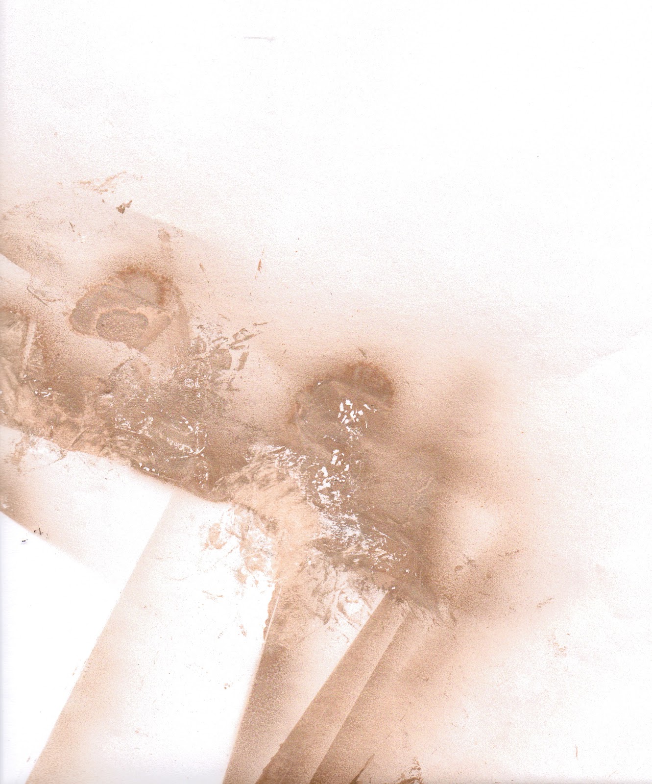
Making Texture With Spray Paint

Today I've been trying to make a sort of abstract pattern using spray paint. The purpose for it is to act as a colour scheme / texture scheme for a project I am working on involving creating an identity.

I tried spraying onto paper and then taking some of the paint back off with crumpled up magazine pages, which worked fine but the best effect I was able to create was made by spraying onto acetate and then extracting. 


This first image is done using white paper, but the magazine paper I used to pick select bits off the page couldn't take as much of the paint off the page as I wanted it to, to reveal more white underneath. 


This second image is much more successful and was created using acetate. Because it is transparent, when I scanned it in - the gaps became even more white due to the light scanning it. Double win! 
This is the image I'll be using for my final colour/texture scheme in project.


These two final images are just the paper I used to cover my floor so I didn't get paint on the carpet! The different layers of paper and acetate that were laid on them made a pretty cool pattern though! 

Sunday, 7 April 2013

Animation: Preview Clip

The past two days I've been trying to refine and perfect the scenes in my Animation sequence ready for next weekend when I am hoping to add in my sound effects and Narrative. I've finally gotten around to adding in a small black dot to represent a small fly that my frog looks up to eat. 

This clip is just a small section of the scene. 
Check it out!


Sunday, 31 March 2013

Animation Development: New Background Design

Today I've been continuing with some animation work and I've started making up the components of my next scenes background! I love adding texture to things like this, it gives it so much more character and life, and I even messed about with the blending options just for a bit of fun!


Original Image with black outline


Original Image, No outline


Altered Image - Looks tropical! 


Final Image - White Outline
This is what I'll be using in my animation for the background. 
It fits with the style I've created so far and looks pretty cool too! I'm happy.

Tuesday, 26 March 2013

Print On Demand: Continued Development

I haven't posted anything in a while as I've taken a few days off due to it being Easter holidays and all. However in terms of work I'm just adding the finishing touches to my Print On Demand book for a bookmaking brief. I am slightly behind with this due to the time off I've taken but I'm hoping that by the end of the day it'll all be sorted and ready to be sent off to be printed! 

I think the hardest part is figuring out what kind of narrative/text I want to accompany the images.


Full spread preview


Close-up of selected pages (Unfinished)


Close-up of Line/Ribbon Detail

Thursday, 21 March 2013

Bookmaking: Page Layout Progress

So, I've pretty much finished making the continuous line that runs through my book look like a ribbon and I've started to add in some of the illustrations that are gonna make the line understandable. After all, it is a rough story, or visual diary even of my movements between different places during a single day.

Because the line is going to have a pattern overlaid on it I have tried to keep the illustrations simple and minimalistic to allow for the extra detail on the line and so it wont look too crowded in the end. Hopefully it's achievable! 


Sunday, 17 March 2013

Print On Design Book: In The Process

I haven't really done much work on my Bookmaking projects for a while and considering there is an informal assessment - but an assessment none the less is tomorrow I thought I best do something.

This is my plan (so far) for an abstracted Print On Demand book based around the theme of 'point' and displaying a days movements and encounters between different 'points'. 

There are still illustrations to be added, colour, page themes and and the ribbon needs to be finished with the correct colours and spacing, so there's still a lot to do. Liking the look of it so far though! 


Saturday, 16 March 2013

Animation: Sequence Sketches

Animation is currently taking up a lot of my time at the moment and no wonder when you have to draw every little movement in a different sketch! I'm trying to enjoy the process, and when I see the final sequence coming together the effort you've put in does make you feel good, it's just the hassle and stress whilst doing it that gets me down. Especially if you have to re-draw something that doesn't fit properly. Thankfully for these, tracing paper was a life saver and Im not that bothered that they change shape slightly. It'll make for an interesting transition I'm sure. 

These images are part of a sequence where my frog is looking up to catch a fly.

Friday, 15 March 2013

Animation: Background Design

I keep forgetting how long making one part of an animation takes! As part of my second scene I've started to create these layers, which will form part of a forest-type background for me to animate over the top of. To fit my running theme / style of illustration I've given them a white outline with painterly textures overlaid within the leaves. Something tells me this is going to take a lot longer than I had planned to make everything this way though. 

Bring on the sleepless nights! 


Thursday, 14 March 2013

Typography: Creating Letters In Smoke


This is another example of some older work I have done last term but its something I really enjoyed making even though it took me around 4 hours! This was a part of a project where I had to create my own Zine (small magazine), which could be based on anything I liked. My topic was a kind of "Good Housekeeping" guide for the dead housewife (so a twist on your standard preconception of this sort of magazine). 

This isn't the title of my magazine but the text created for an advert type page for a new perfume called 'Mascarilla', which I believe means 'Death Mask'. I added a Day of the Dead sugar skull into the foreground and made it look like it was spraying this text out of a trigger spray at the top of its head, so it was all very stylised and awesome (I think!) Lets hope the effort is worth the long term grade!