Friday 26 April 2013

Final Animation Sequence!

Finally finished my animation today!
Watch it here! :D 


Big thanks go to Nik Stojkov and Phil Canvin for all their help with the sound! 

Thursday 25 April 2013

Animation: Character Design Sheet

I'm so glad that my animation work is coming to a close! Today I sent of this, along with some other things to get printed ready for the start of assessments next week and I can't wait to see a physical copy of them! This is one of the final sheets I've produced to accompany my animation and I'm pretty happy with it considering I made it at 4am today! 


Wednesday 24 April 2013

Animation: Storyboarding

Once again, something I anticipated that would take me less than half a day has consumed almost the entirety of it! Today I've been working on finishing everything to do with my animation, which includes a story board and character sheets (still on my to do list before the night is through) and I've pretty much had to re-draw the entire thing, but in a simpler form. I definitely couldn't have done a storyboard with as much detail as the actual animation and to be honest, it's not necessary.

I'm fairly happy with how this is looking so far. Still some finishing touches to add before I get on those character sheets though. ROLL ON 9TH MAY! Summer has been well and truly earned by everyone on my course this year.


Tuesday 23 April 2013

Zine: Accompanying poster

In the same brief as our Zines we also have a few different outcomes we have to show such as 2 postcards and one A2 poster. I decided to base mine around an image I already had made and also a spread that I didn't end up using, so that it wouldn't have been a waste of time!

The name 'Mascarilla Mortuoria' means 'Death Mask'  this essentially is a glamourised advertisement for a new perfume. It's not quite finished yet, but here's what I've got so far! :)


Monday 22 April 2013

Zine Complete! - Layout Previews

I'm actually quite excited that I've finished my zine! I've put a lot of hours into it recently to make it better than it was before my first informal assessment and it's totally paid off (i think). 

A few people have seen unfinished spreads in there and a few have even asked for a copy themselves, which is a real compliment! Hard work does pay off! 

Here are some previews of the spreads I have included in the finished piece.
These of course are not the final things though - just a teaser!


Saturday 20 April 2013

Making Texture: Another Happy Accident

Yesterday I was attempting to make a textured background for one of my magazine pages using an image I found of a bit of rust. With some twisting and turning of the image I managed to create this FREAKIN' AWESOME pattern in the texture!

Sadly, it was too detailed to use as a background but it'd be perfect for using as a tiled image somewhere else! I like these happy accidents I have! :)


Friday 19 April 2013

Zine Design: Finished Dead Housewife / Cover Girl

I started illustrating new components for a spread yesterday for my Dead Housewife based magazine and in the process of drawing this girl, realised that I could also use her as a cover girl for it. 

Here are a few screen prints of the different stages the design went through.
As you can see, half way through I decided to completely change the colour scheme and made everything she was wearing a shade of green.
I also really like the texture I've managed to get into her hair.


                 Snap shots of each step of the design and any changes that were made


Finished design with added textures

Thursday 18 April 2013

Zine Design: Bulking Up The Content

Today I'm working on creating some more content for my Zine, based on a 'Good Housekeeping' magazine - but for the Undead. This particular image is for a page where new, hypothetical products are being reviewed in an 'Up and Coming' section and it is an advertisement for decorative Toe Tags.

I'm trying to keep the theme of the illustrations the same throughout the Zine so everything is being done witha graphics tablet in illustrator, before adding colour and texture in photoshop.
Below is a before and after of one section of this new spread. 


Line Work


Piece Almost ready for spread. 

Tuesday 16 April 2013

Exhibition Poster Graphics: I Finally have an idea!

Finally, after many weeks of despising the promotional side of my Exhibition project I have an idea of what I'm doing with it. I had a tutorial with a tutor and some other students earlier today and this wasn't precisely what they suggested I do after looking at my initial plans, but what I then went on to draw helped me come to this conclusion!

The exhibition is based around the WW1 Uncle Sam posters (well, a selection of them) by James Montgommery Flagg and so I wanted to make a little insignia / logo that I could apply to all promotional items, and tonight... I have finally done it!


I started off in illustrator with my original silhouette line work and added a circle and some lines in for later on. 


I then took the image into photoshop and added colour to make it look like the American flag, and also changed the outline colour to white to stop it looking so cartoony.


Finally, I added some texture as I wanted to make it look less harsh on the page, and everything looks better with texture in my opinion! I'm not sure if this is going to be my final logo idea, I think it's probably worth still playing around with colour levels, but I'm finally optimistic that I'll finish the project with at least one piece of promotion! 
Day: Successful

Sunday 14 April 2013

Creating a brand identity: Poster Promotion

These three screen shots are the three final ideas I had for promotional posters for a graphics project. The whole logo and theme of the brand is based around the old, retro play buttons on cassettes and personal stereos - but with a modern twist. Logically, I called the range 'Play' and Goji is the brand that I am designing for. 

The posters are just an accompaniment to a pattern and a packaging based project, but I thought it'd be nice to try to tie in a poster with it for additional content.


This first one for me makes no sense to the actual theme of the range that I've already created, but it does look nice! 


This for me is one of my favourite designs but it also doesn't fit the existing theme of the range, as it's very minimal texture with lots of white space and is meant to resemble a spray paint type effect with the gold. This is just very decorative. 


This one however DOES fit the style I've been working with and I've also tried to make it look like a paint drip to tie in with the look of the pattern. This is the one I will be developing a little more to make my final poster. All it will need is some added information about the brand and it's good to go!

Wednesday 10 April 2013

To Do Lists: A Depressing View


I've just completed some To Do lists for the next couple of days and as much as I knew I had a fair amount to finish, well writing it out makes it look even worse. In fairness most of my projects are at the 'almost there' stage and just need fine tuning before being printed or made for assessment but I, like a lot of people I've seen on Facebook, am just losing the motivation to do it. 

I'm trying to be super organised and I've been writing check lists intermittently throughout the year, which have seemed to scare me into working, but as of late they're losing their power. Maybe I need to change their colour to bright red to represent the, FUCKING CRISIS AHEAD I feel like I'm heading for. 

This has been the most testing year I've faced academically to date (understandably) - it's not meant to get easier - and I cannot stress how much of a god send and a relief that the start of summer holidays are going to be. 

Bring on the travelling, bring on the booze, bring on the fucking sun.
Deadlines, you will not defeat me.


My "Happy Mistake"

Last night I was trying to make a metallic-looking texture to use as a colour scheme for one of my projects. I'd made some spray paint patterns with gold spray but when I'd scanned them in they lost their shine and their glittery appearance so I looked online for a simple metallic background that I could use alongside the sprayed patterns and combine them somehow to create more texture.

I started off with two separate images:


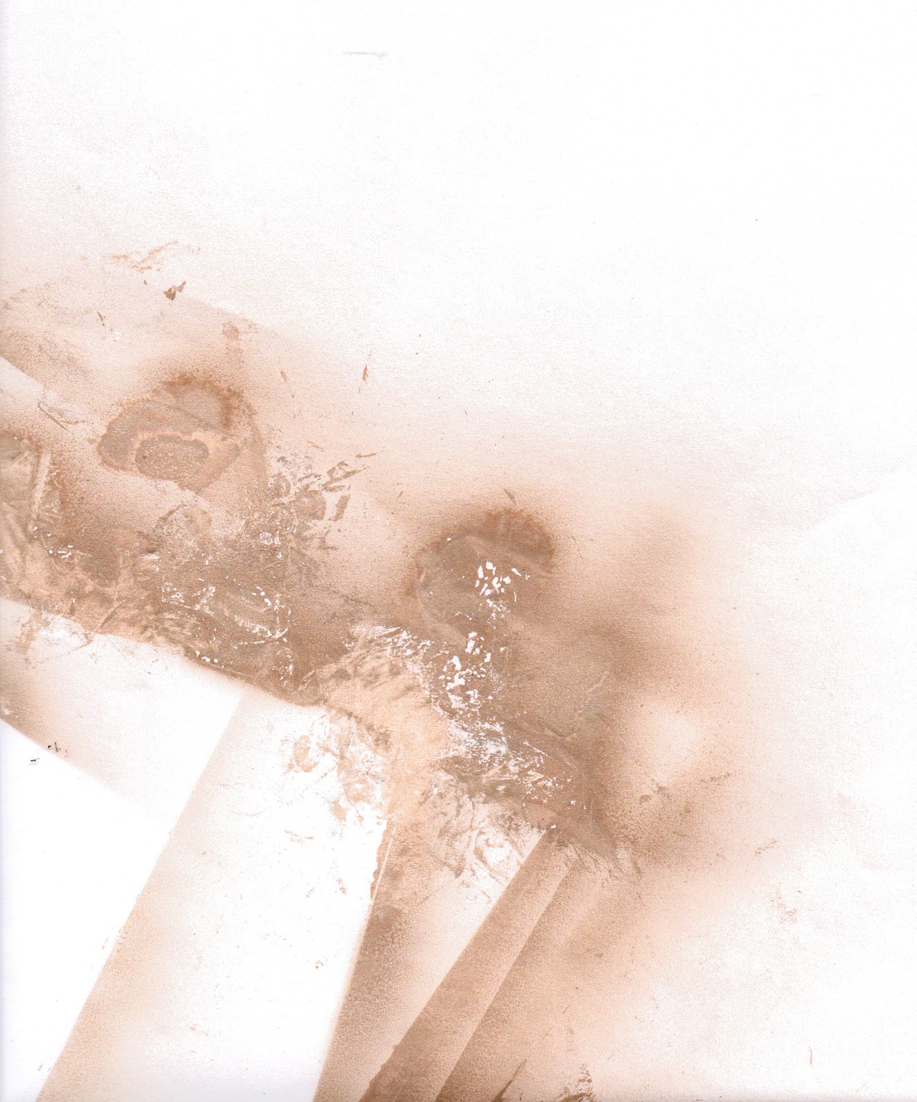
The first the metallic surface I'd found and the second the spray paint texture I made. I tweaked the levels and using the blending mode 'Divide' on Photoshop my main tile was made.


This was the end result of that process. 

As I was using this to cover an A4 sized pattern, or at least part of it, I copied the layer a few times and rotated it, flipped it etc. So that it all blended in nicely together and so that when overlaid onto my pattern, there wouldn't be any harsh lines showing where a few images had been used and stuck next to each other to cover the entire page.

What I didn't realise however until long after I'd finished, is that the pattern I eventually made by piecing a few of these images together was something even nicer than what I had intended! 


This final result reminds me of a kaleidoscope effect, or even some sort of jewellery like amber or rose gold. I guess sometimes the coolest things do happen when you don't intend for them to! Or as my teacher once called things like this... "Happy Mistakes". (But that sounds a bit dodgy to me)

Tuesday 9 April 2013

Making Texture With Spray Paint

Today I've been trying to make a sort of abstract pattern using spray paint. The purpose for it is to act as a colour scheme / texture scheme for a project I am working on involving creating an identity.

I tried spraying onto paper and then taking some of the paint back off with crumpled up magazine pages, which worked fine but the best effect I was able to create was made by spraying onto acetate and then extracting. 


This first image is done using white paper, but the magazine paper I used to pick select bits off the page couldn't take as much of the paint off the page as I wanted it to, to reveal more white underneath. 


This second image is much more successful and was created using acetate. Because it is transparent, when I scanned it in - the gaps became even more white due to the light scanning it. Double win! 
This is the image I'll be using for my final colour/texture scheme in project.


These two final images are just the paper I used to cover my floor so I didn't get paint on the carpet! The different layers of paper and acetate that were laid on them made a pretty cool pattern though! 

Monday 8 April 2013

Step by Step Video of Bookmaking Project

Here's the video relating to the post below! As promised! :)


Bookmaking: Another Finished Project


THANK F**K FOR THAT!
Another project I can cross off my To Do list! 

It's taken me a while but I've finally gotten there, and documented the whole process on video too!

For an idea that started out fairly un-refined and not really sure of where I was going with it,  I'm actually pretty damn happy with how it's turned out. Changing slightly from my original mock-up I think it's come out better at the other side. 


The books are completely different sizes and scales but you can see the initial ideas are the same, but the placement of the spinning wheel and the refinement of the layers have come a long way and a good job too. I think I'd be pretty unhappy if it still looked like that! However, no matter how much I slate the original design, without it I wouldn't have the final piece that I have today! So cheers to you shit mock-up.... You served me well!

I will also be uploading onto here a simple step-by-step video of the process which I recorded as something a bit different to hand in other than a sketch book for when assessment time comes. 


Sunday 7 April 2013

Animation: Preview Clip

The past two days I've been trying to refine and perfect the scenes in my Animation sequence ready for next weekend when I am hoping to add in my sound effects and Narrative. I've finally gotten around to adding in a small black dot to represent a small fly that my frog looks up to eat. 

This clip is just a small section of the scene. 
Check it out!


Saturday 6 April 2013

My Book Design: Professionally Printed

I came home yesterday from a birthday trip and amongst some other packages, this beauty was waiting for me. If anything I think it excited me too much... But it looks so cool! And knowing I made it just adds to it. I feel sorta proud of something and it doesn't happen often!

So relieved that it's another thing I can now cross of the To Do list! :)


Wednesday 3 April 2013

Zine Design: Making Changes / Updating Template

This morning I concentrated my time on bringing my Zine design up to date and making some changes that I though were necessary for my next assessment. The thing I was most concerned about was one of my comical 'style' pages that focusses on 'What apron is best for your body type' (Since my Zine is based on a Good Housekeeping-style magazine for the dead housewife)

The thing I didn't like about it was that I had originally hand drawn, and then scanned in my illustrations, which looked fine, but have ended up not looking like the rest of my illustrations in the Zine as I have done the rest of them digitally. 

Today was all about drawing in some new heads and adding them to the existing bodies. 
Below are the line drawings of the new heads, meaning to be a mix of all ages to fit the theme of the magazine - and then the final result of the page when imported into InDesign.


Monday 1 April 2013

Animation Preview: Clip Still Under Construction

I thought I'd take a quick screen recording of one of my animation scenes to show you. 

I haven't yet finished the scene - I still need to add a bounce into the leaves when the frog jumps on each one and some sound, as well as play around with the graph editor to make the jumps look a little more weighted and lifelike! 

What's going on here has taken me a good few hours to make considering it's only a 12 second clip, but thats due to the fact that there's so many layers involved. Typical of me to make things more difficult than they need to be! Ah well. Hopefully it'll turn out good in the end!